Final Major Project – Cycling Campaign

I have now entered the final phase of my third year at CSA and its not too long till I join the big wide world of work!

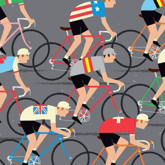
For the last bit of the journey, I am currently undertaking my final major project for my course, Graphic Design. I was encouraged to take on a topic that I am passionate about and feel that there is a real purpose in designing for it. So taking this into account, I have decided to take on a topic that it very current and is becoming more of an influence in people’s lives. I am going to tackle the subject of cyclist behaviour.

Image

Over the years, I have been commuting to Cambridge to go to uni (which is famous for its number of cyclists), and I have witnessed incredibly unsafe behaviour as well as physically being run over twice by unsafe cyclists. I am not saying that all cyclists are like this, as most cyclists have good behaviour and respect for both pedestrians and motorists. But recently, there has been a big increase in incidents and deaths, causing a debate between motorists and cyclist.

When it comes to campaigns, I have seen plenty of design work aimed at telling pedestrians and motorists how to behaviour and respect people around you, but I have noticed that there is no real campaigns aiming towards how cyclists could behave. So I have decided to take on the idea of designing a campaign to raise the awareness of cycling etiquette. As this topic is quite sensitive, I in no way don’t want it to seem like I’m pointing the finger at cyclists, I really want it to be light-hearted – which I hope in the end will have a much more powerful and effective result. At the end of the day, I am both a car user and pedestrian and I would like to see a harmony on the roads were everyone respects one another.

I am looking forward to see how this project pans out and I hope to update my blog with my progress with the project. If you feel that you have any information I could benefit from and or even tell me how you feel about the behaviour of cyclists, I am more than happy and please feel free to let me know!

Wish me luck!
100% Design Week, London (18th-21st September) – Part 2

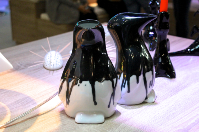
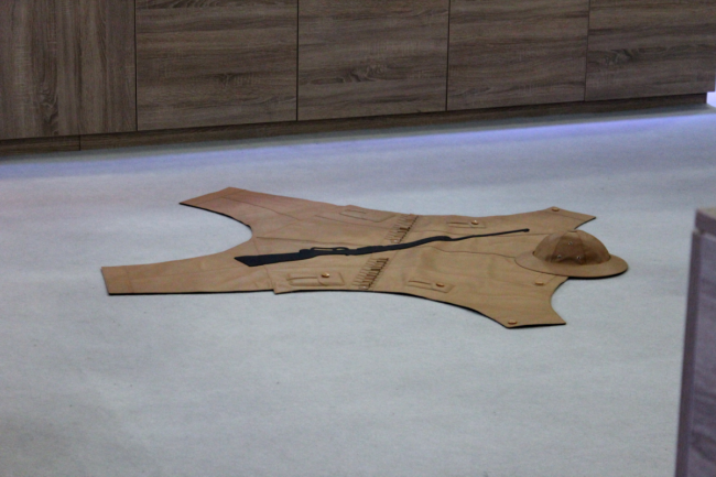
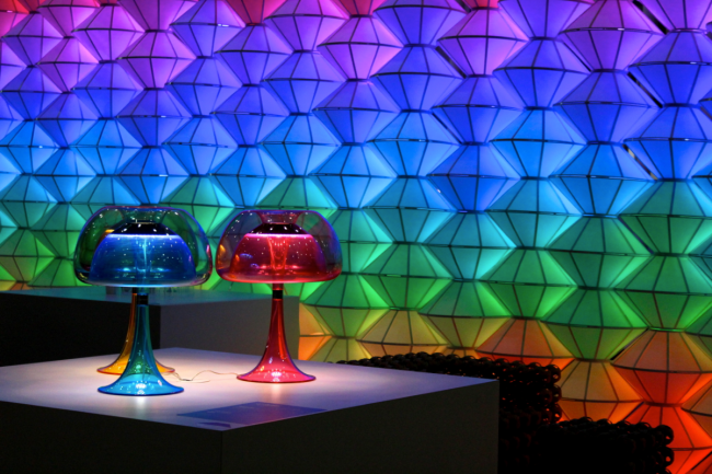
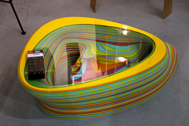
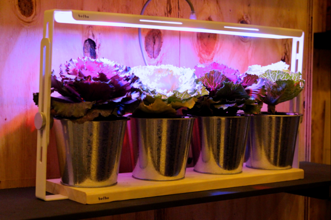
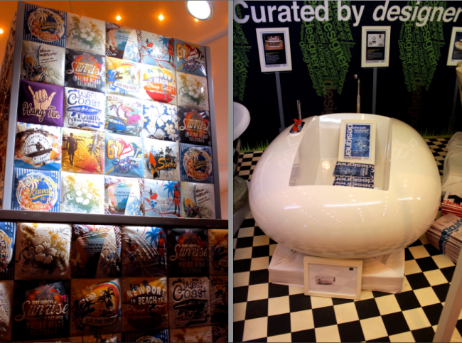
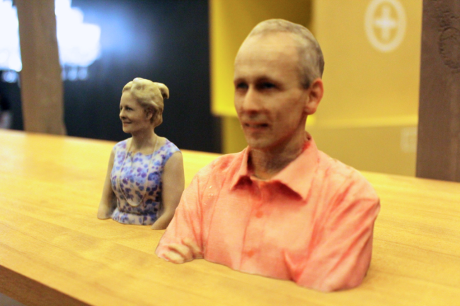
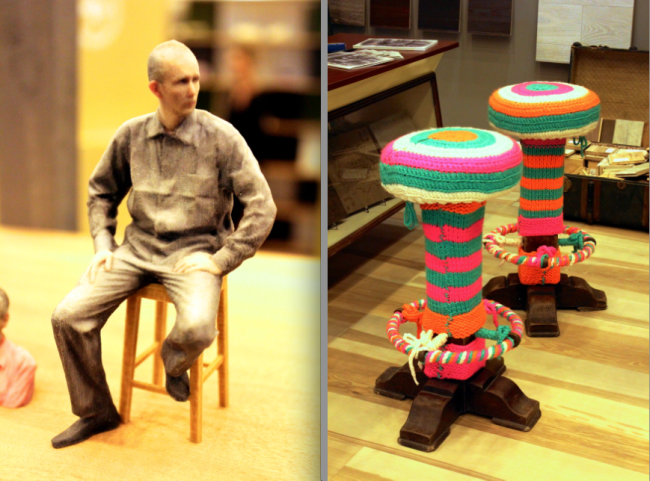
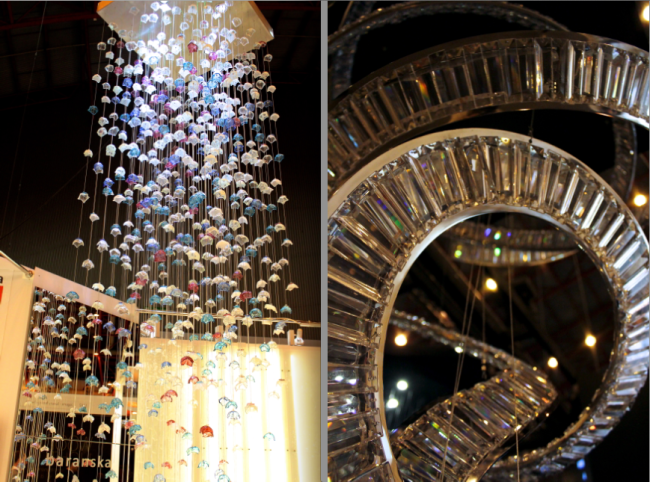
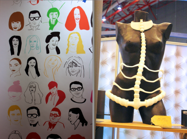
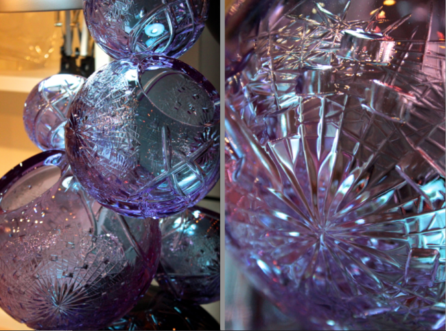
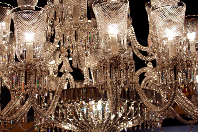
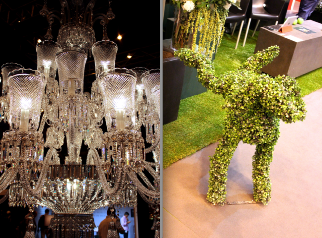
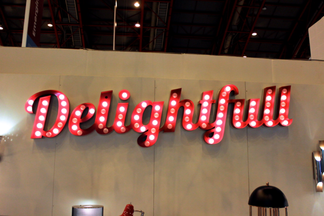
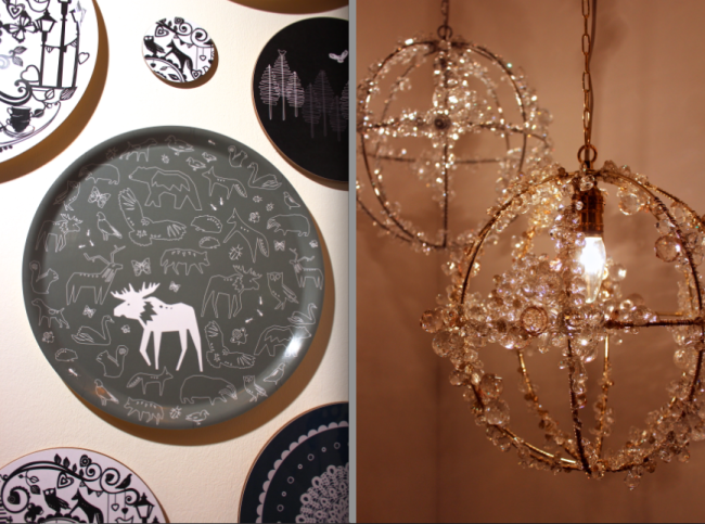
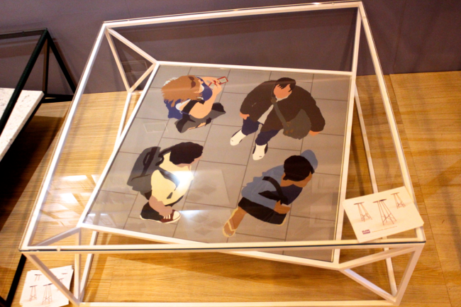
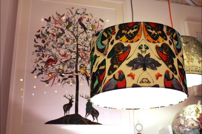
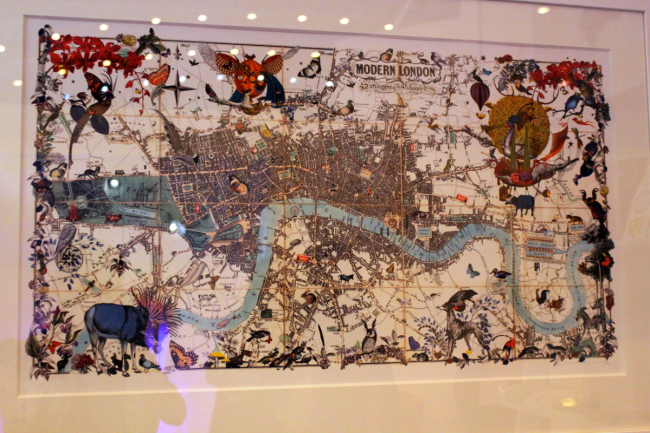
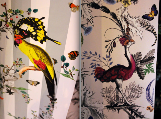
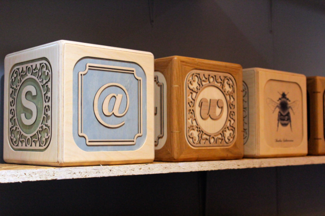
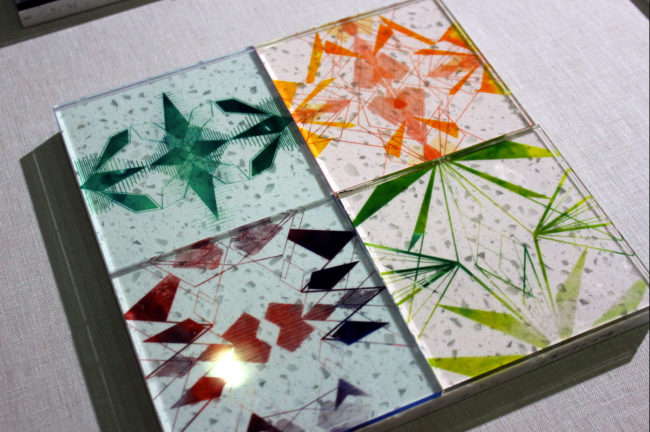
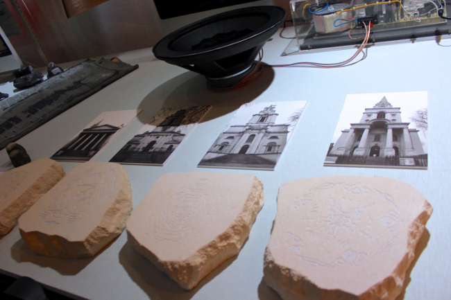
This is the other half of my photo diary of 100% Design. The different variation of design continues throughout as well as the use of colour.

ImageImageImageImageImageImageImageImageImageImageImageImageImageImageImageImageImageImageImageImageImageI throughly enjoyed this year’s 100% Design week, especially being a part of it! I meet so many interesting and inspirational people and I hope that with this visit and experience helping out at the event, will help me within my uni course and help direct me into the career path the future holds for me!
100% Design Week, London (18th-21st September) – Part 1

This is my photo diary for the recent design show 100% Design. This event was on a couple of weeks ago and would have been uploaded earlier, but I have been battling an illness in these past weeks, so apologies for it taking a while to be posted. I was lucky enough to be part of this event by helping out with Belgium furniture company BULO on their stand and so this gave me a chance to wonder round and see all the other companies and designers displaying their work and ideas. It was a truly brilliant show, and had a fantastic turn out!

I have been attending this show for years, but this was the first year where I was able to take it seriously and was able to gather lots of inspiration and advice that can help me out on my future career/plans after I finish university!

Below are the first selection of images I took throughout my 4 day stay at the show.

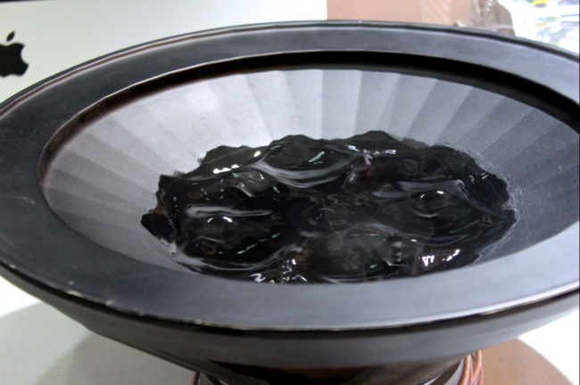
ImageImageImageImageImageImageImageImageImageImageImageImageImageImageImageImageImageImageImageImageImageThere was such a selection of different forms of design, and this year, it was nice to see it not be too dominated by furniture! Designers and illustrators really caught my attention with their use of colours, shapes and just general uniqueness! One aspect of this years event that I throughly enjoyed was the use of a lot more use of colour. At the entrance you were greeted by a light tunnel and within the show was a huge wall of light changing colour as well as different areas being highlighted with colour.

Revisiting Watercolour Painting

It was a lovely summers day this week, so I felt like taking full advantage of this, sit outside in the fresh air, and decided to get back into watercolour painting.

The last time I did watercolour painting was 3 years ago for my Art A levels, I looking back now, I remember that I really used using this method of painting but never continued using it. So this perfect summers day seemed like a good opportunity to do so.

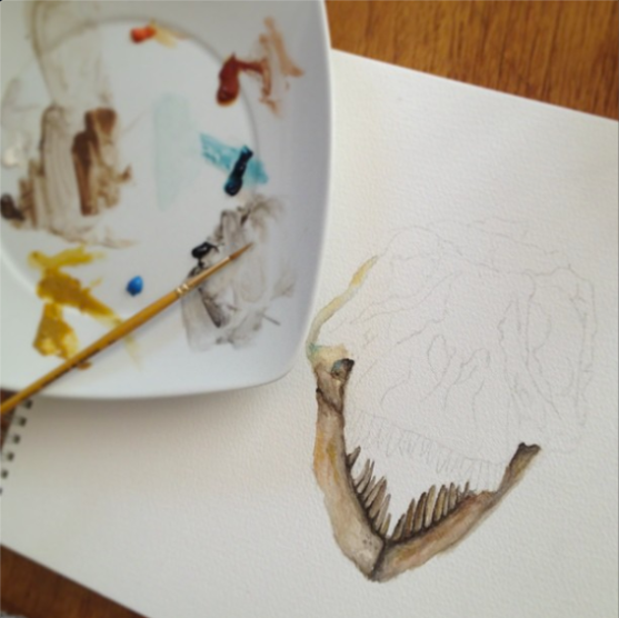
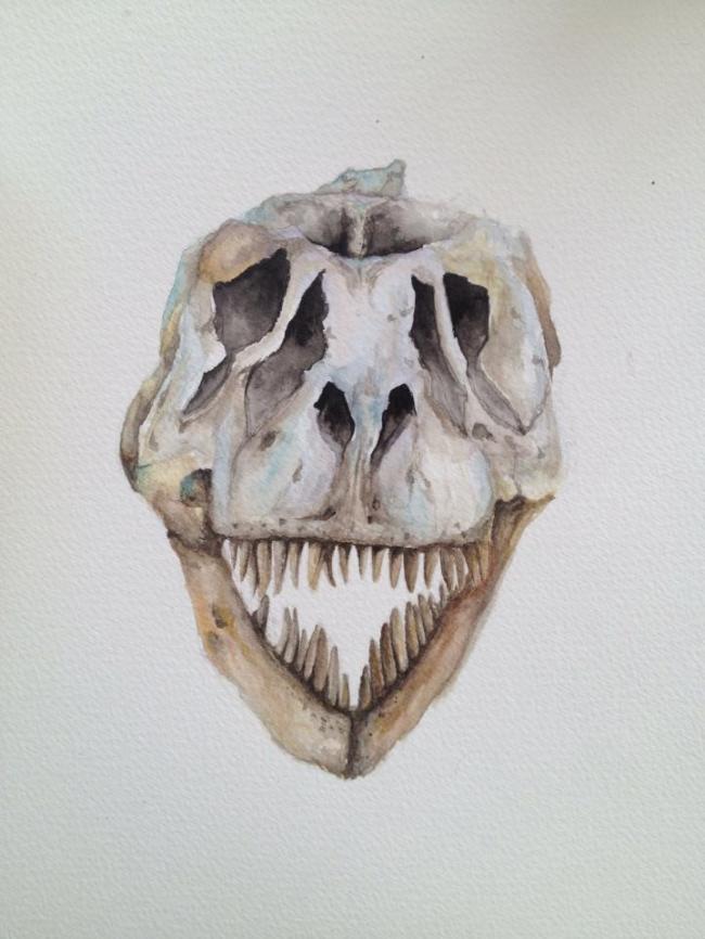
I decided to draw and paint an image that was quite small as I didn’t want to take on a huge image just yet as I had no idea how the outcome of the painting would be, so I went for a safe option and painted an image of a Tyrannosaurus Rex skull. While painting, I felt that it wasn’t really going to plan as the colours just weren’t blending together and just generally looked rubbish, but I pushed myself on and didn’t abandon it. Overall, I am pleased with it, I don’t think its the best in the world, but seeing as I haven’t used watercolours in years, I think it’s a good start.

I can happily see myself using this method of painting more in the future!

Image

ImageImageImage

One cloudy night…

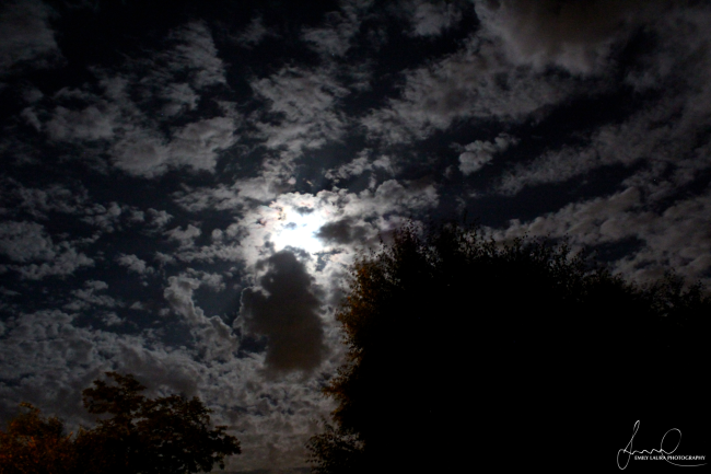
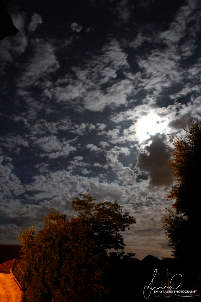
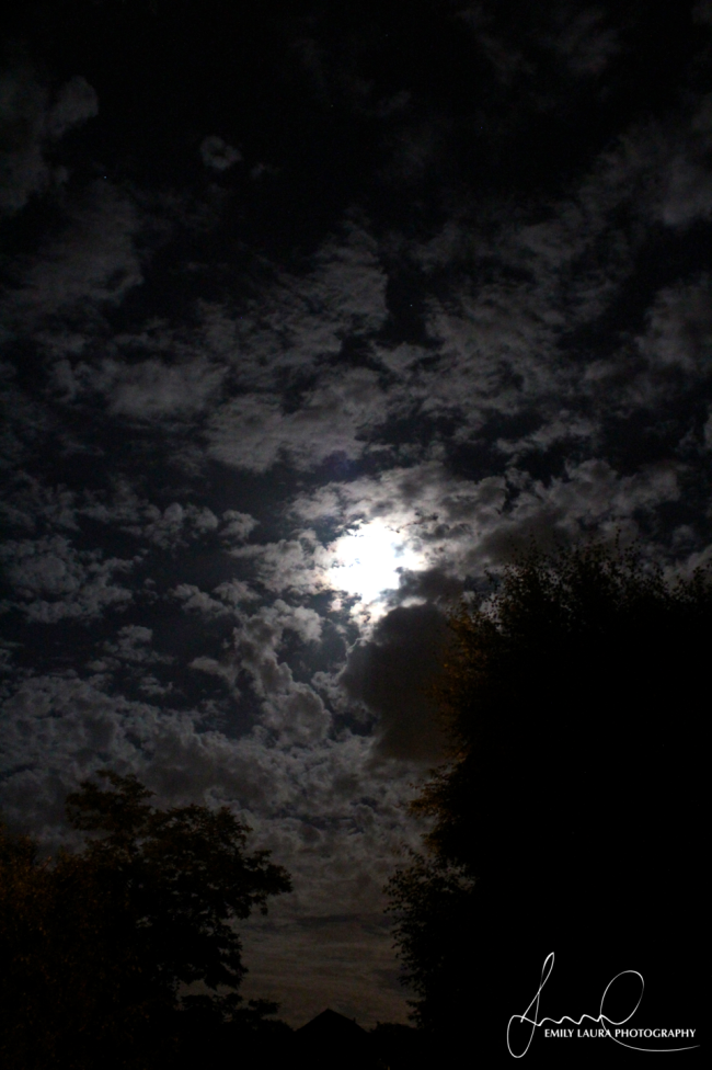
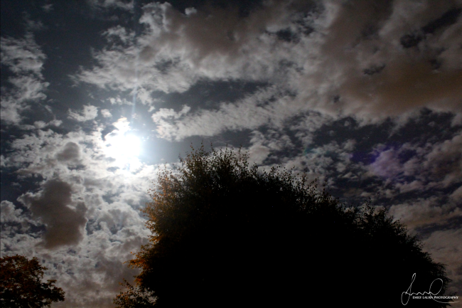
Last night I found myself not being able to sleep and this was mainly because I had this glaring light beaming on my face as I was trying to sleep. Thinking it was a neighbour who hadn’t turned their lights off, I lifted my blinds to find the culprit, however, I found that I was greeted with a very different scene.

The moon was big and bright, and with it being a cloudy night, the moon highlighted every cloud in the sky which I could see for miles around from my bedroom window! I really wanted to capture the unusualness and beauty of the night sky, so I grabbed my camera and took a few shots trying to do the sky justice. The photos came out much better than I anticipated and they come off like a surreal world! The long exposure allowed the light to really shine and make the night sky look as bright as the day sky.

I hope you enjoy the shots I managed to take as much as I do!

Image

Image

Image

Image

Image

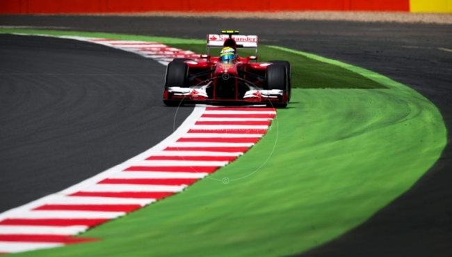
(A late) selection of my Silverstone F1 Weekend 2013

I apologies for the lateness of these photos as I have just come back from a two week holiday and I have had no internet connection throughout that period, so I have only just been able to get these images up and sorted! 

With these photo (and this is a very small selection of them), I have cropped them down to create more dramatic imagery and allows the focus to be more driven. They are also in black and white to add to the drama of the photos. But, maybe at a later date, I will upload some colour photos as well. 

Image

Image

Image

Image

Image

Image

Image

Image

Image

Image

Image

Image

Image

Image

Image

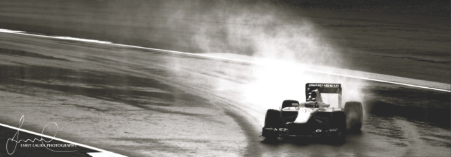
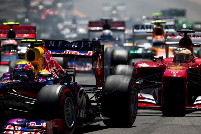
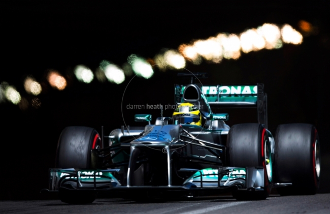
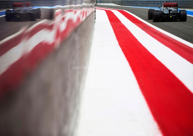
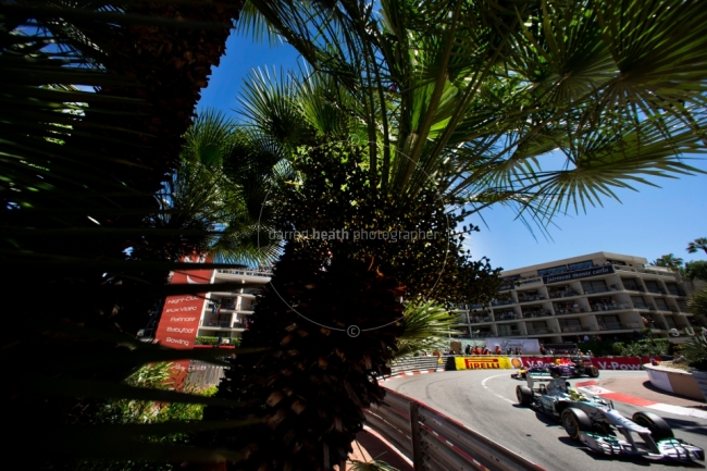
F1 Photographer – Darren Heath

Recently, I attended the Silverstone F1 weekend, and this has always been on my list of things to do as I am a massive fan of F1! It’s probably the only sport I am dedicated to follow and so going to this year’s Silverstone was a dream come true! 

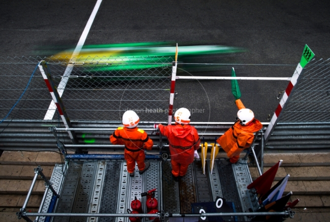
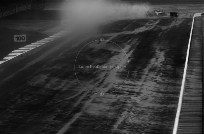
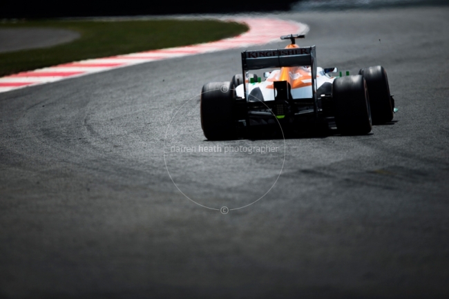
I felt it was also a great opportunity to take my professional camera with me to the event and use throughout the weekend, however, I have only been used to photographing animals who are relatively slow compared to a F1 car which can reach speeds of over 200mph! So before I went to the event, I decided to look around at how professional photographers take photos of the cars, and one particular photographer who’s work I fell in love with is that of Darren Heath.

Below is a small selection of his work that really inspired me, and I highly recommend that you check out his website http://www.darrenheath.com  and check out all of his photography  for motor sports and F1.

Image

Image

Image

Image

Image

Image

Image

Image

Image

Image

Image

Image


(I am currently editing my photos of my F1 weekend and will be up shortly!)

Private viewing for the Harry Potter Graphic Arts exhibition

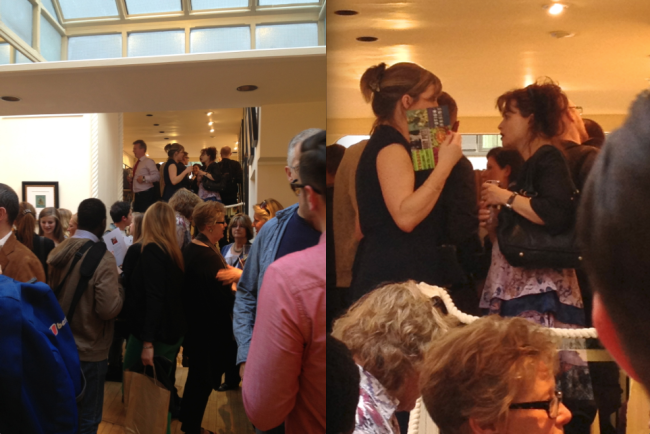
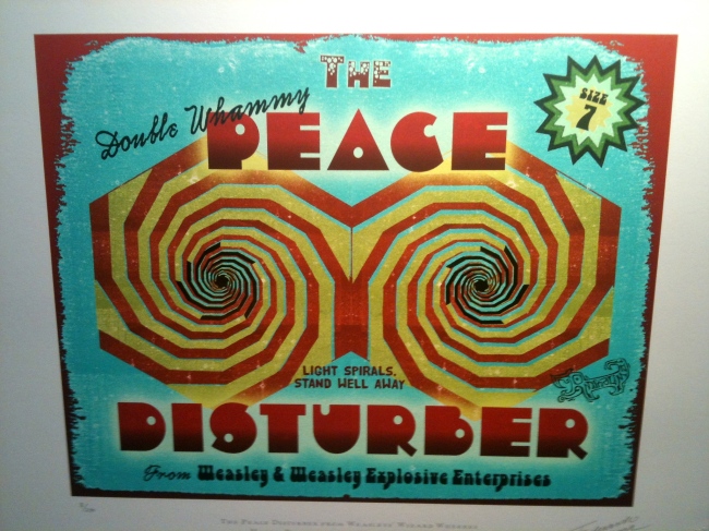
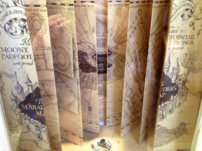
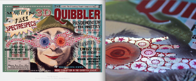
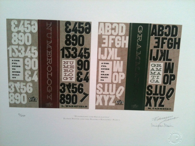
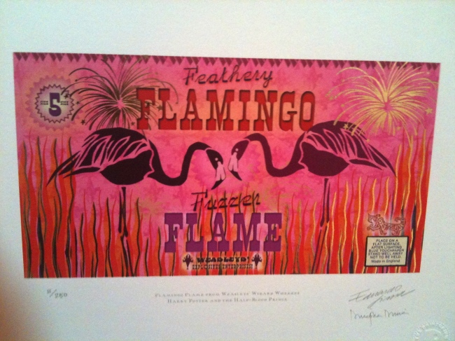
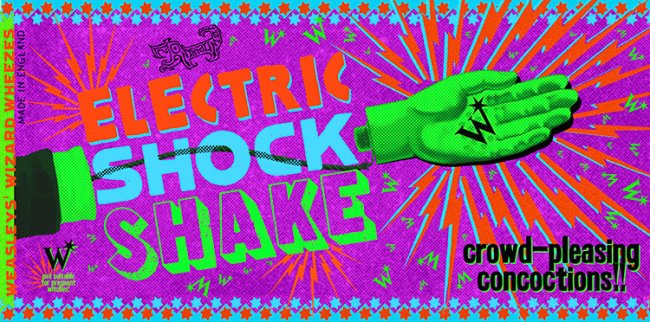
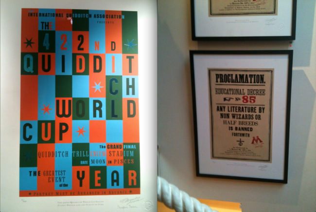
A couple of weeks ago, I had the absolute pleasure of being invited to the private viewing of the graphic arts from all of the Harry Potter movies, all designed and created by the Printorium! And being quite a huge fan of all the films, I jumped at the opportunity and attended.

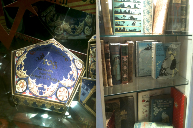
It was a real experience to be apart of the viewing of such high quality and iconic pieces of artwork. Pieces like the Potion Making book cover (Half Blood Prince), the chocolate frog packaging (The Philosopher’s Stone), Marauder’s Map (Prisoner of Azkaban), an abundance of packaging and posters from the Weasley joke shop, posters and tickets for the Quidditch World Cup and many many many more! It was just a surreal moment to come so close to the designs you have become so familiar with over 10 years! You could really appreciate the fine detail and effort that went into creating these designs!

Below are photos from this exhibition and I must apologies again for the quality! I only had my phone of me and the images don’t really do the designs justice! But I have also gathered a few other images so you can get a closer look of the designs.

Image

ImageEven Bellatrix Lestrange (Helena Bonham Carter) came to the viewing!! And later on Narcissa Malfoy came in as well (Helen McCrory)!!

Image

Image

Image

Image

Image

Image

Image

Image

Image

Image

Image

Image

Image

Image

Image

Image

Image

Image

Image

Hopefully the photos are not too diabolical that you cannot appreciate the design, detail and colours. Unfortunately the exhibition has closed now, but if you were fortunate to visit the gallery, I hope you enjoyed it and appreciate it as much as I did!

Below is a link to their website dedicated to their work with Harry Potter where you can see more pieces of the HP designs

http://www.theprintorium.com

Below is another link to their design work website, where you can look at their other design pieces. I highly recommend looking at it!!

http://www.minalima.com