A couple of weeks ago, I had the absolute pleasure of being invited to the private viewing of the graphic arts from all of the Harry Potter movies, all designed and created by the Printorium! And being quite a huge fan of all the films, I jumped at the opportunity and attended.
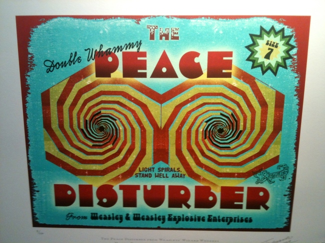
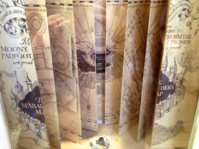
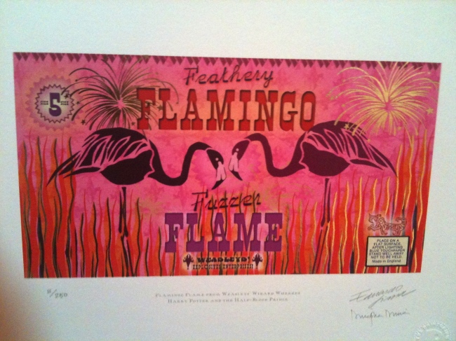
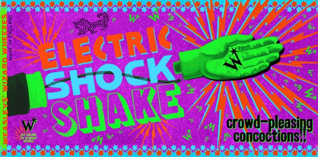
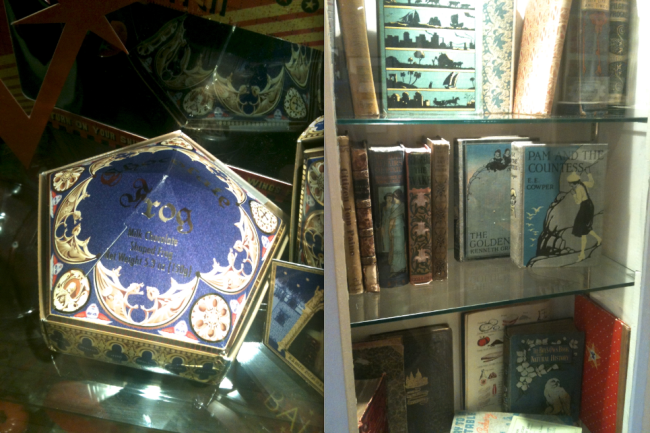
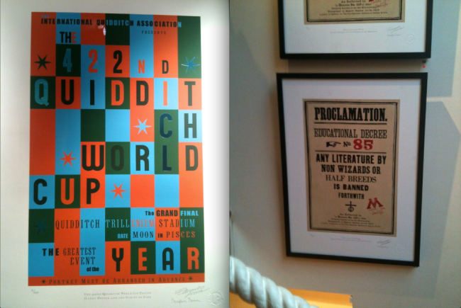
It was a real experience to be apart of the viewing of such high quality and iconic pieces of artwork. Pieces like the Potion Making book cover (Half Blood Prince), the chocolate frog packaging (The Philosopher’s Stone), Marauder’s Map (Prisoner of Azkaban), an abundance of packaging and posters from the Weasley joke shop, posters and tickets for the Quidditch World Cup and many many many more! It was just a surreal moment to come so close to the designs you have become so familiar with over 10 years! You could really appreciate the fine detail and effort that went into creating these designs!
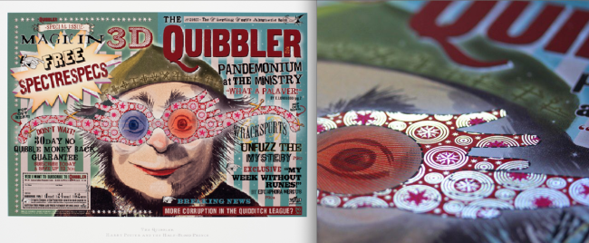
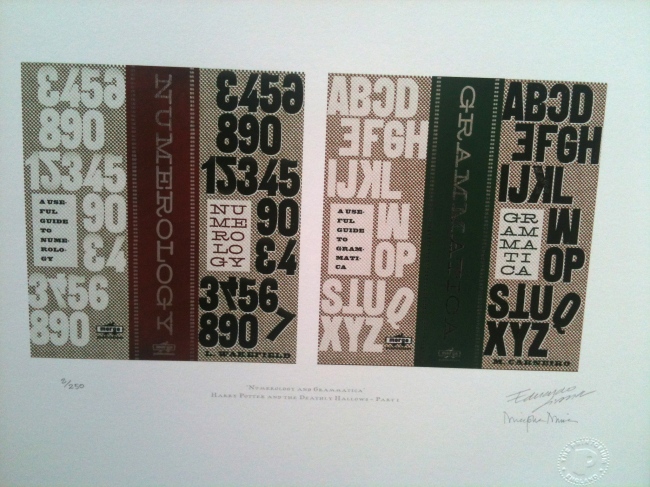
Below are photos from this exhibition and I must apologies again for the quality! I only had my phone of me and the images don’t really do the designs justice! But I have also gathered a few other images so you can get a closer look of the designs.
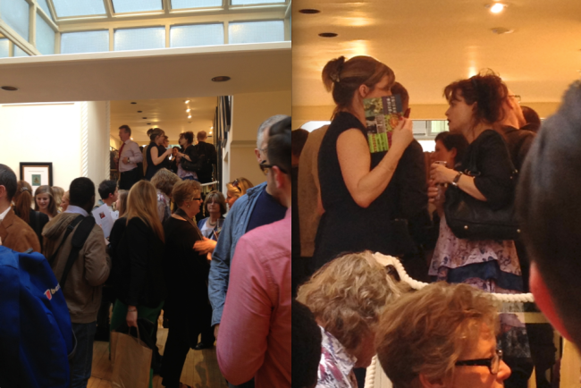 Even Bellatrix Lestrange (Helena Bonham Carter) came to the viewing!! And later on Narcissa Malfoy came in as well (Helen McCrory)!!
Hopefully the photos are not too diabolical that you cannot appreciate the design, detail and colours. Unfortunately the exhibition has closed now, but if you were fortunate to visit the gallery, I hope you enjoyed it and appreciate it as much as I did!
Below is a link to their website dedicated to their work with Harry Potter where you can see more pieces of the HP designs
Below is another link to their design work website, where you can look at their other design pieces. I highly recommend looking at it!!


