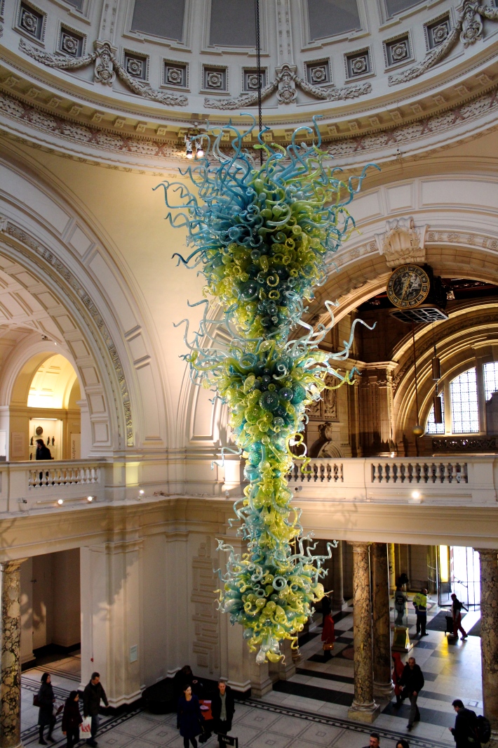
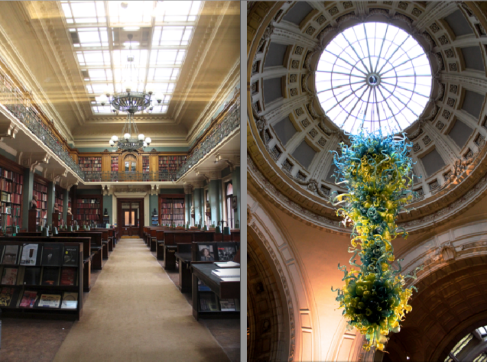
For a uni project, I’m having to design some work for the V&A for their new extension developments, and so this called for a Sunday trip to London, in the cold and the rain (as any dedicated student would!), to visit the museum itself. (I will apologies now that this will be a vey long post! It was a very long day, so there is a lot to fit in!)
(Grand entrance the V&A)
This trip was about understanding the museum and what treasures it holds within its walls. I wasn’t restricted in only having to look at one certain exhibition or time period, I would look at everything! I have been going to the V&A for many years and so I have a good understanding of ‘what is where’ in the museum, and so, as I usually do, I start from the top downwards.
(Upstairs view of the Medieval & Renaissance exhibition hall)
(Upstairs view of the Cast Courts – These two towers are massive! – as shown in the ground floor image below)
This is a piece of Iron work that can actually be seen from the grand entrance hall as it is perched on an open balcony. I’m not a religious sort, but I can easily appreciate and admire the craftsmanship that went into making such an exquisite piece of work.
I am an absolute sucker for stain glass windows! They are just so beautiful with the vibrant colours and detail, design. No matter what the image is, I am always entranced.
I haven’t the foggiest what this actually is, but it is such an intriguing piece.
Over the years of my uni course, I have discovered I have a thing from textures, materials and detail, so being at the V&A I was in abundance of such things! I am only going to show a couple photos because if I put every texture and material up, it would take you at least 3 days to get through and finish this post!
So throughout most of the day, I was walking back and forth, accounting every detail of the museum and its collection, and this brought my trip to the V&A to an end…but my day in London didn’t stop there…
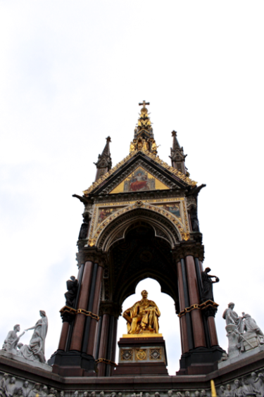
…firstly, the rest of my day would continue with walking up exhibition road to take a look at the Prince Albert Memorial (it wasn’t exactly pleasant with the cold and the rain, but with the light, I would be able to get good pictures of the memorial)…
…I would then continue the day by visiting the place of my childhood, The Natural History Museum! Every time I visit London, I must always make a visit to my favourite place and seeing as the V&A and NHM are next door neighbours, it was perfect! But….I was greeted by this…
…I HAVE NEVER SEEN THIS PLACE SO BUSY IN MY LIFE!! There was a queue from hell to get into my favourite exhibit, the dinosaurs!! I was gutted, but this was not going to ruin my trip, so I went to the next best place for a photography shoot was the gems and minerals sections, and surprisingly, it wasn’t busy at all! This is a small collection of photos I took of the collection. (None of the photos have been edited in colour so all the colours are true to the natural eye).
(I think I stood in shock for about 10 minutes with the fact that these diamonds glowed in the dark!)
And so, to end the whole busy day off, I headed to the Mammal section of the NHM before setting off home…
So this covers what I do went I go out to research for a project. Making sure I cover all grounds of the research needed and also going above and beyond by looking at the surrounding area and history to look at their influence on the museum. I also like to make research days always end with a bit of fun for me by visiting places that I can just go mental and take photographs that I love. I really just love going out for research!
And so thats that. The end of the post. Congratulations if you were a trooper and made it all the way to the bottom of this post without getting bored! I just had such a busy and photo-filled day, this was the best I could do to shorten the day!


